A Good Map
Every map can be critiqued, giving it compliments and critisisms.
Every map can be critiqued, giving it compliments and critisisms.
These critiques are to inform the map maker to improve on mistakes and make good things great.
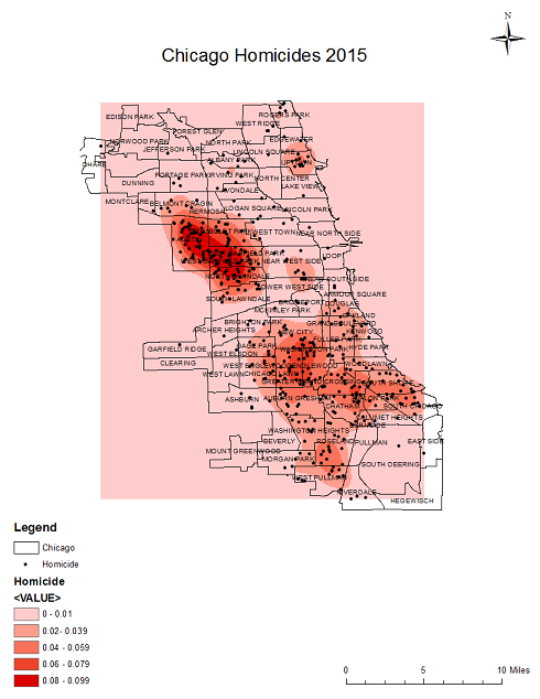
Map 1
Map 1 has a few things wrong with it, but it does tell us some things. Here are the pros and cons.
Pros:
- The map has an informative title. The location, subject and year are all given.
- The density is shown using color variation.
Cons:
- The color for the density should cover the whole background.
- The dots on the map aren't necessary.
- The map doesn't tell you it's density we can only assume.
- The legend bar values should have lables.

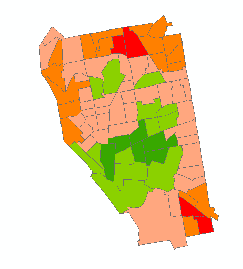
Map 2
This map has a lot wrong with it. With the noted cons the person could probably make a more effective map.
Pros:
- They tried to make a map.
Cons:
- There is no way in knowing what this map is of. It needs a descriptive title.
- The colors chosen for this map (red and green) are difficult for blind people to differentiate between.
- If this map was supposed to show a certain field, a legend should be used to explain the colors.
- Direction of map is completly unknown.

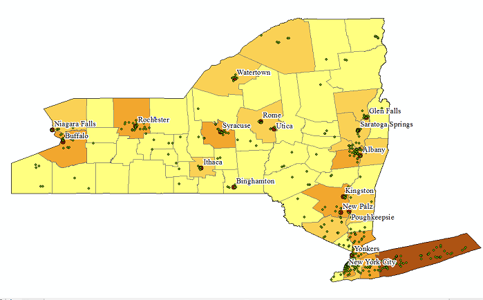
Map 3
For this map the maker seems like they were in a rush. The information appears to be just thrown into a document. With more time I'm sure they could improve the map.
Pros:
- We can tell this is a map of New York.
- Some cities are labled, which may be important.
Cons:
- We again don't have a title and therefore don't know what this map is of.
- With no legend the points on here are useless. They need to have an explanation to be meaningful.
- The colors seem to just show how many dots are in each box. Chloropleth maps should only be used for things like percentages.
